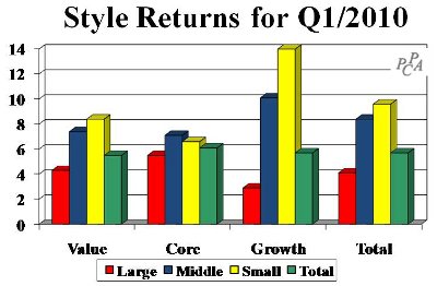
Although the first quarter of 2010 started badly, with US stocks losing more than 3% in January, the market recovered most of those losses in February, setting the stage for 6%+ returns in March. All of the first quarter return was earned in March.
As the chart below shows, every US style posted a positive return for the first quarter of 2010, continuing the recovery that began in March of last year. This quarter’s 5.7% market return brings the 13-month return from March-to-March to 66%.
 Smaller companies fared best, while all three styles—Value, Core, and Growth—fared about the same in aggregate. Value, Core, and Growth stock groupings within each size category are defined by our proprietary aggressiveness measure, a proprietary measure that combines dividend yield and price/earnings ratio.
We designate the top 40% (by count) of stocks in aggressiveness as “Growth.” The bottom 40% are called “Value,” with the 20% in the middle falling into what we choose to call “Core.”
 Performance by sector
On the sector front, Finance came roaring back with a 12% return, followed closely by Consumer Discretionary and Industrial stocks. Other sectors earned mid-to-low single-digit returns, except Telephones & Utilities, which lost 2% in the quarter.
Although it’s not shown in the chart, cross-sectional volatility was highest in Consumer Staples, indicating a wide performance spread across individual stocks in that sector. Financial held that distinction for most of 2009.
 Now let’s look outside the US. While 2009 market performance far exceeded domestic returns, the first quarter of 2010 was a different story. Foreign markets earned 6.7% in local currencies but only 2.9% in US dollars, about half the US market return, as the dollar strengthened against other currencies.
Japan led the quarter with an 8.5% USD return. Europe ex-UK was the only region that lost money, declining 1.8% in the quarter. EAFE and ADRs lagged because of their larger company orientation. Large companies (not shown in the exhibit) earned 1.8% in the quarter while mid- and small-caps returned 5.5% and 6.3% respectively. Unlike the US, where core was in favor, growth stocks fared best outside the US.
How did your portfolio perform?
Traditional peer groups are poor barometers of success or failure, but advisors still believe that there are no better choices. Not so. As a benchmark, we use Portfolio Opportunity Distributions (PODs), our proprietary method that represents the range in performance of all of the possible portfolios that managers could have held when selecting stocks from a specific market.
 For S&P 500-based portfolios, for instance, we provide the following PODs. Use this table and graphic in the meantime to evaluate your investment managers. (Performance numbers for periods ending 3/31/10 are available now, but most peer groups won’t be released for a month.)
We believe that this chart will help you compare your equity portfolio’s performance with all possible performances-not just its peer group’s. Note, for example, that a return of 40% for the year ending March, which would appear to be good on its surface, is in fact bottom quartile. But extend the timeframe out two years or more, and a mere 1% return is a top quartile winner.
© 2010 RIJ Publishing. All rights reserved.


