
Part I: The Present
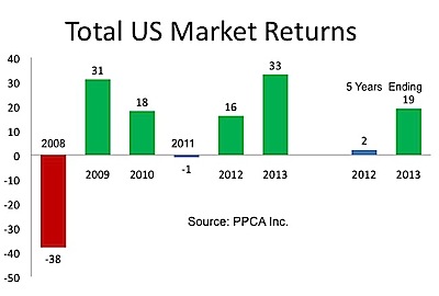
After feasting on the U.S. stock market’s 54% run-up from 2009 to 2010, we starved in 2011, suffering a 1% loss. Those who said the markets were due for a healthy lull turned out to be right. Stock markets both here and abroad had a good 2012 followed by a spectacular 2013, generating another 54% return in the U.S over two years.

The past five years have been among the best on record, almost erasing the memory of the five years ending 2012, as shown in the graph on the right. These past five years produced the third highest return, albeit following two of the lowest performing 5-year periods.
Although concerns about another market bubble have emerged, the graph below suggests otherwise. Even though stock prices have surged, both dividends and earnings have kept pace. Prices appear to be reasonable.

It’s useful and insightful to examine the sources of these returns. The following formula works quite well:
Return = Dividend Yield + (1 + Earnings Growth) X (1 + P/E expansion/contraction) – 1
This formula is simple yet elegant, stating that total return equals dividend yield plus sources of price change, namely the compounding of earnings growth with investor-driven changes in the price/earnings (P/E) ratio. I’ll use this formula again when we discuss the future.
The components of returns for the past two five-year periods are shown in the graph on the right. As you can see, P/E expansion and contraction has been the driving force.  This component is primarily driven by investor behavior, and may well be the cause of future economic results rather than being a leading indicator of the economy.
In his 1998 book, Beast on Wall Street, Robert Haugen contends that the market crash of 1929 caused the Great Depression, as opposed to predicting it. In other words, the market drives the economy rather than anticipating it. If so, recent P/E expansion bodes well for the economy, if this expansion continues.
The big question remains: what will be the ultimate effects of quantitative easing? There’s no doubt the bond market is being manipulated and that this has a material effect on stock markets. Stock buy-backs are proliferating because money is cheap. Corporations can borrow at very low interest rates to buy their own stock, which drives up share prices. Will buy-backs continue when the brakes come off of interest rates? What forces will drive future P/E expansion/contraction? We don’t know.
America the Beautiful
The U.S. stock market has performed best, particularly in 2013, as shown in the graph below. Consequently there is a wide dispersion of performance among multi-asset managers, especially target date funds. The primary benefits of target date funds are diversification and risk control, both of which suffered on a relative basis in 2013. 
The most diversified funds underperformed their U.S.-centric competitors, as did funds with rigorous risk controls. This leads to the potential for error on the part of plan sponsors, and to the hiring and firing investment managers for the wrong reasons.
Using the return components formula above, the U.S. stock market’s 2013 return breaks down as follows:
33% Return = 2% Dividend + (6.5% Earnings Growth compounded with 23% P/E Expansion)
Some styles and sectors have thrived while others have struggled. Outside the U.S. country-by-country performance varied widely. The following section examines these results.
Recent winners and losers
U.S. stocks
Growth stocks led the way in 2013, with small-cap growth stocks earning 44%. Large-cap-core companies earned “only” 23%, and large-value earned 28%. Style returns clustered around 30%, which was a pretty good place to be. This has been one of those unusual periods where the “stuff in the middle” (core) has not performed in line with the “stuff on the ends.” (I use Surz Style Pure® classifications throughout this commentary.) Core might well outperform value and growth going forward, in a regression toward the mean.
Stocks by sector
On the sector front, consumer discretionary and health care fared best, earning more than 43%. By contrast, materials eked out a meager seven percent return, and telephones-and-utilities also lagged at 16%. Consumers led the year, in contrast to previous periods when infrastructure spending and the “Chindia” effect led the way.
Over the past five years, smaller companies of all styles have led, as have consumer-oriented stocks. The big change in 2013 was in the leadership of technology stocks, which had performed relatively well prior to 2013. Interestingly, the previous five years (2004-2008) were led by value stocks in the energy and materials sectors. The leadership of the U.S stock market has shifted dramatically.
But the interesting details lie in the cross-sections of styles with sectors, especially for those who want to exploit momentum effects, as discussed in “Part 2: The Future” below.
Stocks by region
Foreign markets earned 16.5%, lagging the U.S. stock market’s 33% return and EAFE’s 23% return. Japan and Europe earned 30% on a dollar basis. In yen, the Japan return was an even more impressive 44%. The Japanese stock market soared this year as the yen was purposely weakened against the dollar. Countries outside Europe and Japan earned less than 11%. Latin America lost 4% (all in $US).
On the style front, core surprised, as it did in the U.S. It led rather than lagged, though not by much.
Leadership in 2013 shifted to Japan and Europe from Latin America and Australia/New Zealand. Style leadership shifted from value to core. EAFE and ADRs have both underperformed. This is because smaller companies have performed best. They’ve earned 20% per year while large companies have lagged with annualized returns of 16% per year.
My 2012 Commentary indicated that Japan would become a bargain in 2013—a deep value play—and that was a pretty good call. As concerns about a weakening U.S. dollar have been allayed, at least temporarily, interest has diminished in Latin America and Australia/New Zealand.
Part II: The Future
To forecast future returns, you can use the components formula shown above. Simply plug in your earnings growth estimates and ending P/E. If 2014 turns out to be an “average” year (See yellow cell in table below), we should see a 16% loss. But returns may not be average. The purple cells highlight a band around the average and indicate a performance range from +13% to -18%. Losses are not in most forecasts for 2014. Only contrarians would predict a 16% loss.

This framework can also be used for foreign markets. Because they are currently near historical averages, their expected returns in 2014 are near norm, at plus-9%.
Despite recent market gains, or perhaps in response to them, investors have flocked to hedge funds as defensive moves. Demand for these products should increase substantially in the years ahead as the harsh realities set in. Separating the alpha wheat from beta’s chaff will always be crucial in selecting hedge funds.
The market will continue to put a premium on human intellect. We won’t pay much for exotic hedge fund betas (risk profiles). We’ll know the difference because we’ll abandon simple-minded performance benchmarks like peer groups and indexes, and replace them with the science (as envisioned in my short film, the Future of Hedge Fund Evaluation and Fees).
Forecast for 2014
In Searching for Alpha in Heat Maps, published in early April 2013, I showed how to use heat maps to profit from momentum effects. I have published my forecasts each quarter, and promised to report on their success at year-end. Here’s that report.
Momentum investing worked in 2013 for investors who went long my forecasted winners and short my forecasted losers. If you simply went long my forecasted winners, you won in the U.S. but not in foreign stocks, relative to their respective markets. If you simply went short my forecasted losers, you won in foreign stocks. The momentum of lagging segments persisted longer than the momentum of winners.
Now I’ll offer forecasts for the first quarter of 2014 using heat maps. Shades of green indiciate good performance relative to the total market. Shades of red indicate underperformance. Yellow is neutral.
A U.S. equities heat map for the year ending December 31, 2013 can be seen below. The best performing market segment comprises $45 billion (not shown) of small-cap growth companies in the industrial sector, which earned 62.9%. Small-cap growth companies in the materials sector performed worst, losing 16.7%.
Many quantitative managers employ momentum in their models, buying “green” and selling “red.” Fundamental managers use heat maps as clues to segments of the market that are worth exploring, for both momentum and reversal potential.

Using this heat map, I forecast the following domestic winners and losers for the first quarter of 2014. I’ll continue to track the results on a cumulative and quarterly basis. Let the games continue.

Similarly, the following table is a heat map for foreign stocks in calendar 2013. Health care stocks in Canada have thrived with a 61% return, while materials in Canada have suffered 33% losses.

Accordingly, my forecasts for foreign market returns in the upcoming quarter are:

© 2014 PPCA, Inc. All rights reserved.