


The viability (survival) of a retirement portfolio is a function of the withdrawal rate each year and the performance of the portfolio in that same year. For retirees, a key concern is a bad sequence of portfolio returns within the first five to six years after they begin taking withdrawals. Other important variables include the asset allocation of the portfolio (the driver of performance) and the total portfolio cost (the expense ratios of the underlying investments plus the adviser’s management fee).
In this study, I find that retirees face little danger of portfolio failure after the first five years or after 25 years, assuming:
- Withdrawals starting at age 72, when distributions from qualified savings must begin [Note: Proposed federal legislation would raise the starting age to 75]
- A withdrawal rate based on the IRS RMD (required minimum distribution) Uniform Lifetime Table for qualified savings accounts
- A diversified portfolio (see below) with a starting value of $1 million
- Total fees of 1% per year
In the process, I also find that percentage-based withdrawal strategies (such as the RMD rules) are superior to withdrawals of fixed dollar amounts adjusted upward each year for inflation.
The study employs an Excel-based tool that allows a retiree (or pre-retiree) to visualize the dynamics of retirement portfolio durability (survival), based on the nominal performance of the financial markets over 70 rolling 25-year periods from 1926 to 2019. The impact of taxes was not considered.
I’ve used this spreadsheet tool in my research for many years. The tool accommodates many different sets of assumptions—about withdrawal rates, asset allocations, retirement ages, life expectancies and portfolio balances—based on each client’s circumstances. Because it relies on past performance and on average annual withdrawals, it can’t be used to make firm predictions. But by helping people visualize the range of possible outcomes that stem from a particular withdrawal strategy, it can help foster a client’s confidence in the future and have a calming influence during market downturns.
Core asset classes since 1926
There are four core asset classes that we can measure back to 1926: US bonds, US large cap stock, US small cap stock, and cash. These asset classes represent the building blocks of a retirement portfolio.
Over the 94-year period from 1926 to 2019:
- US bonds produced an average annualized return of 5.28% (based on the Ibbotson US Intermediate Government Bond Index from 1926-1975 and the Barclay’s Capital Aggregate Bond Index from 1976-2019)
- Large cap US stock (S&P 500 Index) produced an average annualized return of 10.20%
- Small cap US stock produced an average annualized return of 11.23% (as measured by the Ibbotson Small Company Stock Index from 1926-1978 and the Russell 2000 Index from 1979-2019) over the 94-year period.
- The performance of cash (90-day US Treasury Bills) was 3.38%
Other asset classes were not included because they lacked at least a 94-year performance history.
As shown in Figure 1, there is a strong case for optimism among retirees using the RMD strategy, starting at age 72. Given the $1 million starting balance (as shown by the dotted red line in the graph), the average portfolio balance after five years of RMD-based withdrawals was $1.245 million (as shown by the dotted black line) and after the full 25 years of withdrawals the average portfolio balance was $1.429 million (as shown by the blue vertical bars). In short, if the retiree withdraws only the amount of money specified by the RMD (and no more) a diversified retirement portfolio stands a good chance of growing over time.
Figure 1. 94-Year Analysis of a Four Asset Retirement Portfolio
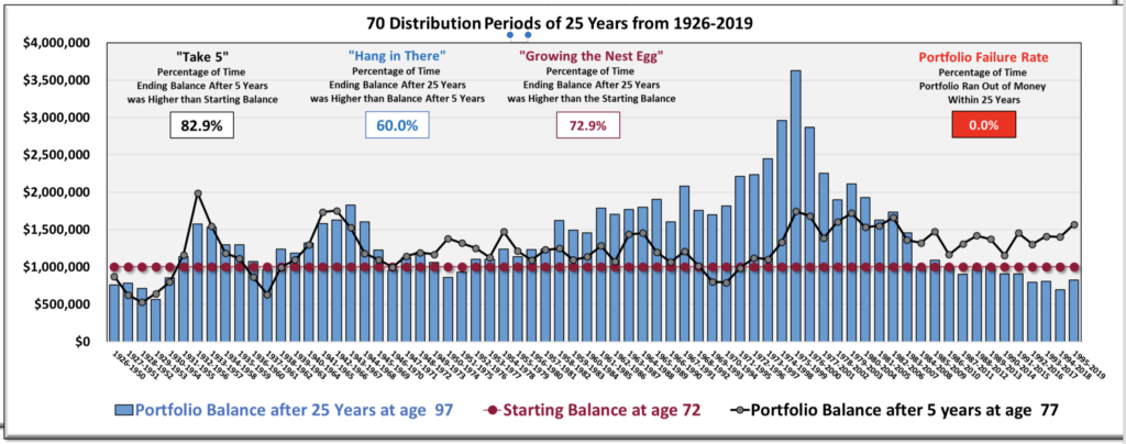
The graph visualizes the experience of 70 different retirees, each starting his or her retirement one year after the last. The first person retired in 1926 at the age of 72 and withdrew money (based on the current RMD divisors) for 25 years. At the age of 97 (in the year 1950) that retiree’s portfolio balance was about $750,000 (as shown by the leftmost vertical blue bar).
The next person retired in 1927 and experienced a different sequence of returns. Her ending account balance 25 years later (1951) is shown by the second blue bar (about $780,000). The 70th person retired in 1995 with an ending account balance in 2019 of roughly $800,000.
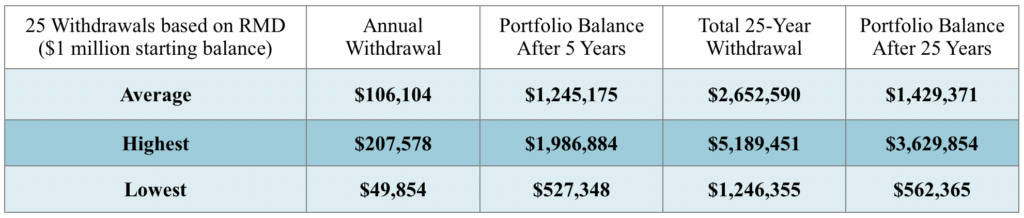
Among these 70 hypothetical retirees, the average annual withdrawal over their respective 25-year withdrawal periods (up to the age of 97) was $106,104 (see Table 1). The average ending account balance after 25 years was $1,429,371—or more than $400,000 larger than their starting balance (in nominal terms).
Note the three summary statistics in the upper left corner of Figure 1. The first is called “Take Five.” It represents the frequency at which the portfolio balance after five years of annual withdrawals exceeded the starting balance. Based on our assumptions, this occurred 82.9% of the time. The relationship between the dotted black line and the dotted red line allows retirees to see that their portfolios can in many cases grow over the course of retirement.
The second statistic is “Hang in There.” It represents the percentage of time the portfolio balance after 25 years exceeded the account balance at five years. The relationship between the horizontal dotted black line and the vertical blue horizontal bars visualizes this fact. In two cases, the portfolio was “underwater” (below the starting value of $1 million) after 5 years, but rebounded to finish well above $1 million after 25 years. These long-term views help protect clients from the effects of “recency bias” (extrapolating a recent trend into the future) and helps them avoid panic-based decisions after a market hiccup.
Said differently, a rough initial sequence of returns does not necessarily presage that the portfolio will die an early death. So, the client can hang in there. This statistic shows that, even after a poor five-year performance, a retirement portfolio is likely to rebound more than half the time. The portfolio glass is actually more than half-full. Sadly, many retirees operate with a fear-based “glass half empty” mindset when it comes to the durability of their portfolios. This analysis help change pessimism to optimism.
The third statistic in Figure 1 is “Growing the Nest Egg.” It refers to the percentage of time that the ending account balance exceeded the starting balance after 25 years on a nominal basis. Based on our assumptions, this occurred nearly 73% of the time over the 70 rolling 25-year periods in this analysis. That’s another reason for the retiree to feel optimistic about the future.
Does optimism fade at some point?
So far, we have only examined a portfolio that uses the annual RMD withdrawal starting at age 72 (and no withdrawals in excess of the RMD). What if a person starts withdrawing from a portfolio that is not subject to the RMD, and is uncertain how much to withdraw each year? Below is a summary of the outcomes 25 years later, based on a variety of annual withdrawal rates from the same portfolio described above. As in Table 1, the results shown in Table 2 are based on 70 rolling 25-year periods from 1926-2019.
Table 2. Withdrawing a fixed percentage of the portfolio balance at the end of each year
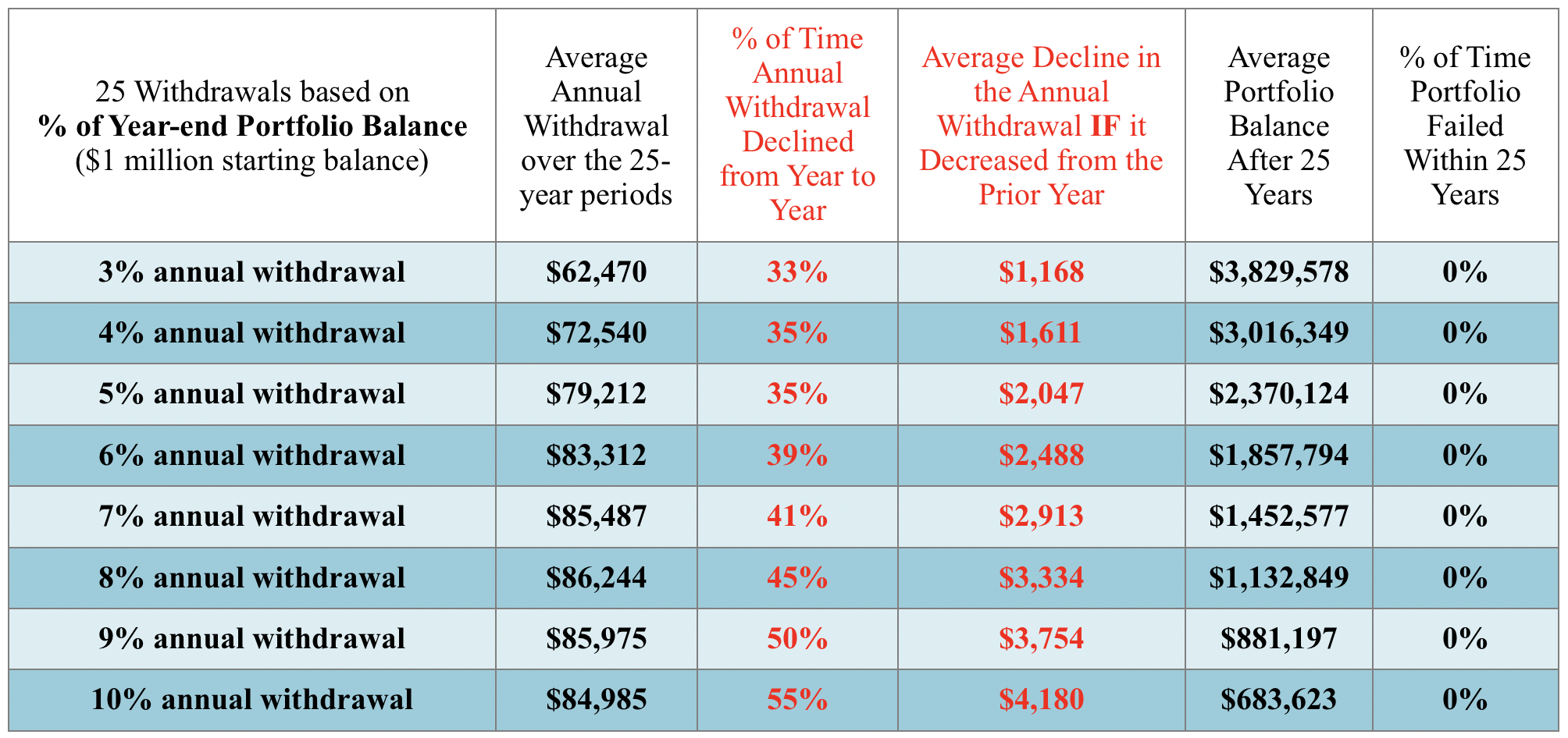
As you can see, the higher the withdrawal rate, the greater the chance that income would decline from one year to the next, and the greater the drop in income when a decline occurs. But, again, this analysis can be encouraging for the client. The drop in income never exceeds five percent and, because we adjust income downward after a down year in the market, the portfolio never fails in the long run.
Table 3. Withdrawing an inflation-adjusted amount each year
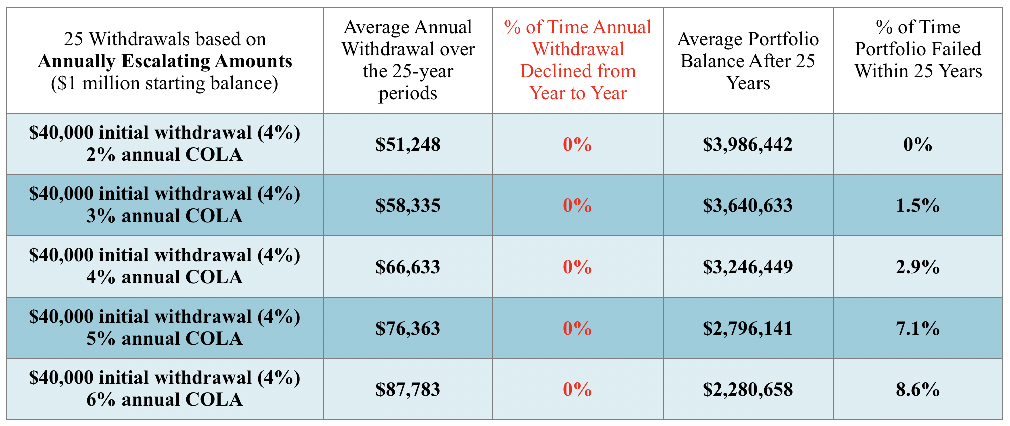
Table 3 offers scenarios where the annual withdrawal percentage is raised to keep pace with increasing expectations for inflation. For this more aggressive withdrawal strategy, the results are not as encouraging. A retirement portfolio is much more likely to experience long-range failure when a fixed, inflation-adjusted withdrawal strategy replaces a percentage-based withdrawal strategy.
The spreadsheet I’ve introduced is a powerful teaching tool. It allows an advisor to engage a client in a conversation that involves a variety of “what-if” scenarios that can be visualized within seconds. To schedule a demonstration of the spreadsheet please contact the author via email at [email protected].
© 2020 Craig Israelsen. Used by permission of the author.
